# First Steps
This step-by-step manual will ǵet you started to create a TISGraph report within a few minutes. A more detailed explanation of functionality will be found in the other chapters of this documentation.
# Creating a New Report
If you are working on an empty database, in order ot create reports, you first need to create a category.
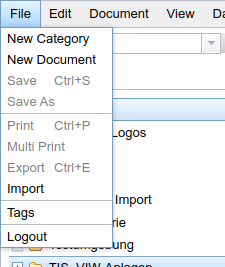
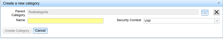
- Select File → New Category
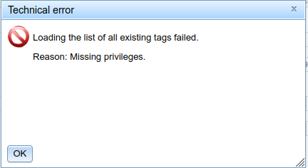
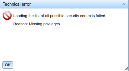
Should you get an error message like the following, either already at start-up or during execution of the here mentioned steps, please contact your administrator. These error messages typically result from insufficient permissions being assigned to your user group. Your administrator will be able to assign you to the proper group for your tasks or alter your group's permissions.
- The dialog for creating a new category opens. Choose a name for the new category, and one of the offered access restrictions (your administration should already have configured these). Finish by clicking "Create Category".
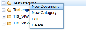
- The new category will now be shown in the document tree. Open the context menu by right clicking on the category. Select "New Document" in order to create your report.
- The following dialog will now open:
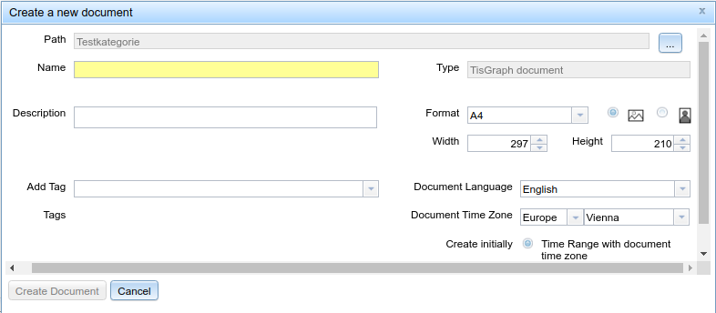
The yellow background of the "name" field signifies that this is a mandatory field which must be filled.

Optionally you can add tags to your report, but these must previously have been created in the tag tree (tree which orders documents by tags)

The document language directs the formatting for date values and other locale-dependent features.

Time zone settings in TISGraph are needed for correct interpretation of time-based info provided from data sources. The value you can set here will be used as the default when creating new objects like graphs, but can be overwritten any time.

The first component of data provided by TISGraph data sources can be interpreted either as a numerical value, or as a formatted time stamp (the latter is more common). If you set an initial time range, it's typically used to pre-set the time-based axis of graphs to that time range (e.g. 01/01/2021 - 01/01/2022). Both time and value ranges can later be added, changed or deleted.

After setting your desired parameters, your report will be created. The order of the user interface is summarized here.
# Creating Graphs
Before creating your first graph, a short explanation to TISGraph's concept of pages and layers. Every TISGraph document can have an arbitrary amount of pages and layers. Layers are their own entities - the same layer can be assigned to multiple pages. A typical document could have the following structure:
- Pages Page01, Page02, ..., Page08
- A background layer, which is set as the first layer of every page
- Layers Layer01, Layer02, ..., Layer08 which are set as the second layer of each corresponding page.
Because of this it is sufficient to include elements like a headline, a logo or a content pane in the background layer without having to repetitively re-add them. The actual content can be added to the page-specific layers.
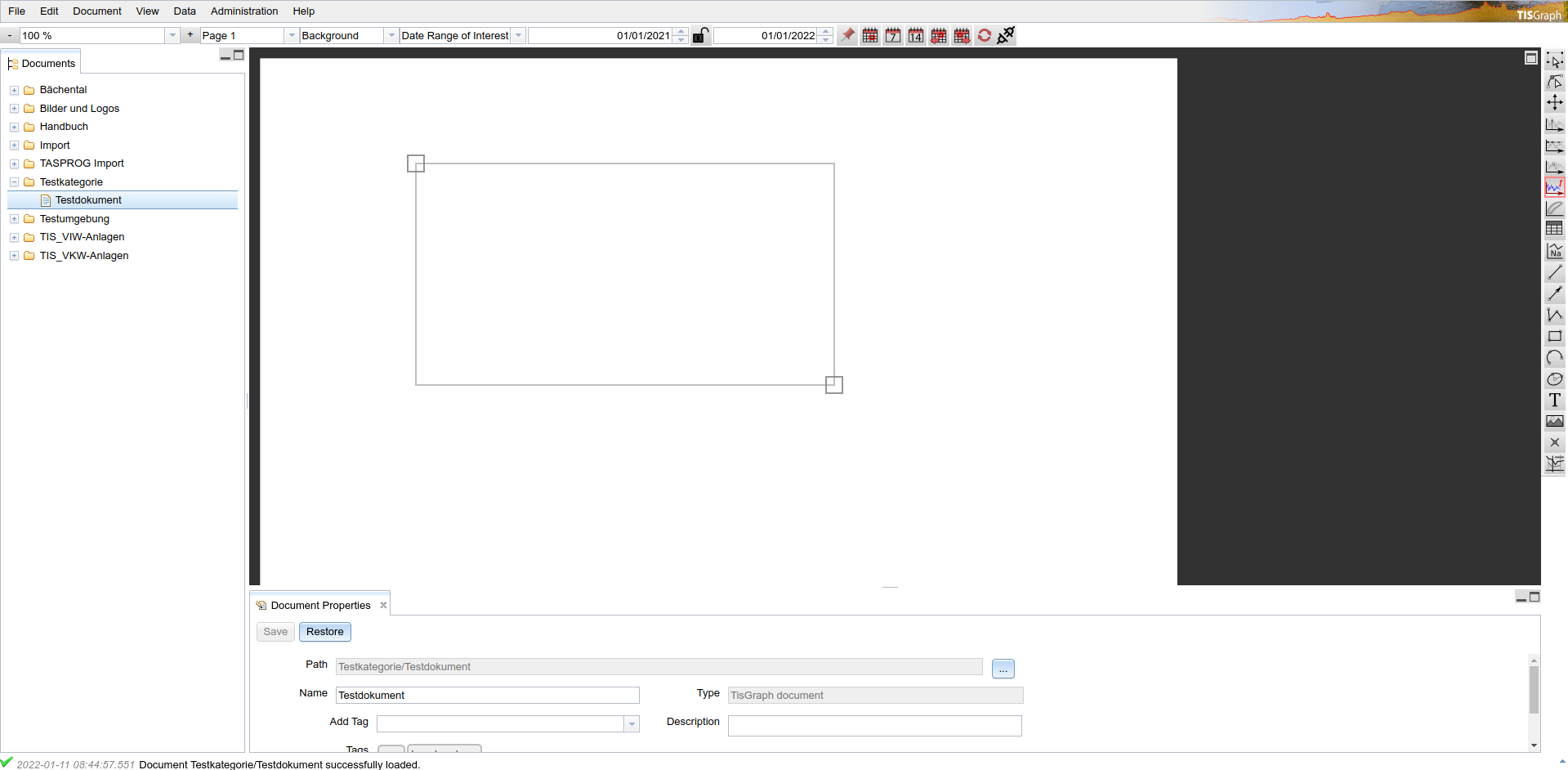
A newly created document, by default, contains one page, a background layer and a front layer for that one page. For adding a graph, it is recommended to switch to the front layer:

The following steps describe how to actually create the graph.
- Activate the "Create parametric graph" tool in the right-side toolbar:

TIP
This tool initiates the creation of parametric graphs. In TISGraph, time-based and parametric graphs on an application level only differ in a few settings. The same creation/editing dialog is used for both types.
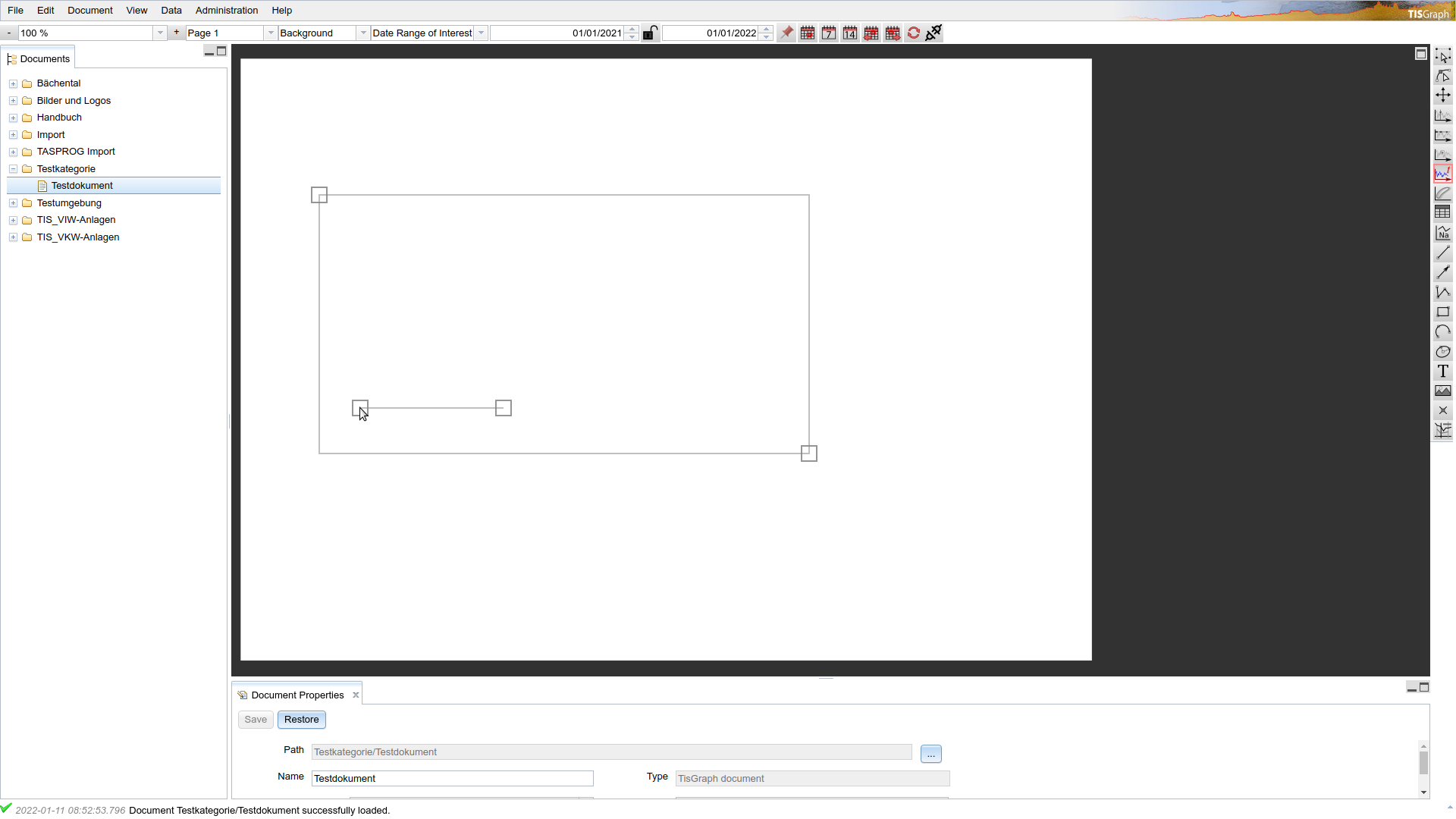
- Define the top left corner of your graph by left clicking once on a point inside the document. Afterwards, designate the bottom right corner by left clicking again at the desired location.
- The tool will now ask you to position the legend for the graph. Confirm the position the position by left-clicking again. In case a legend is not desirable, simply click on arbitrary location within the graph - the legend can subsequently be disabled in graph settings.
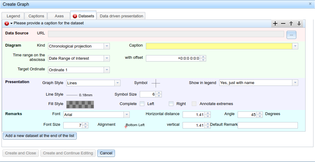
- After confirming your legend location, the creation dialog opens. Configuration is distributed over four tabs. The red mark on the "Datasets" tab indicates that there is a problem on that tab which makes it impossible to complete graph creation right away. Typically this mark hints at the incomplete state of mandatory fields, or the existence of invalid values (such as input "123f" on a numeric field).
- Most of the numerous settings in the dialog are already pre-configured to sensible default values:
- Coordinates are set to conform to the rectangle drawn with the "Create graph" tool. The measurement unit used here are print millimetres (which might not be exactly one millimetre on the screen, depending on zoom level).
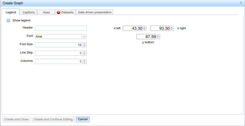
- In the "Legend" tab, you can optionally define a header for the legend, or just disable it completely.
- In the "Captions" tab, you can define annotations for every individual side of the graph.
- In the "Axes" tab you can define the properties of the abscissa, as well as those of any amount of ordinates. Configuration of each axis looks as follows:
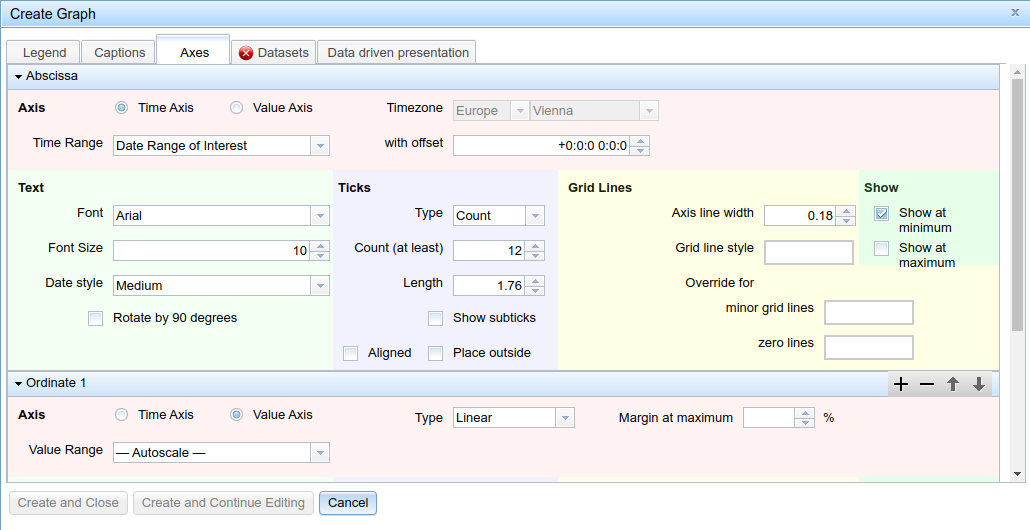
- Because we are currently creating a time-based graph (the setting for that is found in the tab "Datasets", described below), the default setting of the abscissa as a time axis, and the setting of the (only) ordinate as a value axis are sensible in this context. For parametric graphs, setting the abscissa to a "value axis" makes it interpret the numeric data source as numbers instead of formatted timestamps.
- Binding an abscissa to the "date range of interest" means that the graph will alway conform to the date range of the provided dataset, minimizing dead space.
- "—— Autoscale ——" value range on the ordinate means that the scale of the value axis will always conform to minimum and maximum of the provided dataset's values.
- Additionally, you can optionally set parameters such as text properties of axis annotations, frequency of axis ticks or grid lines. The "Show" segment in ordinate settings lets you determine on which side of the graph this axis is meant to be drawn.
- After mostly leaving all settings alone so far, we now need to perform a few settings regarding the rendering of datasets. Generally most (time-based) datasets will be rendered as a curve in the finished graph. Therefore, there can be numerous datasets in any one graph. For the sake of this tutorial, we will leave it at one for now:
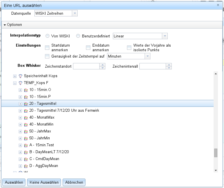
You will need to add a data source, as well as configure any desired annotations and the stroke style to be used for it in the graph. In order to do that, please click the "..."-Button to the top right. This will open the following dialog, in which you can (in this example) add a time series from a WISKI data source tree:
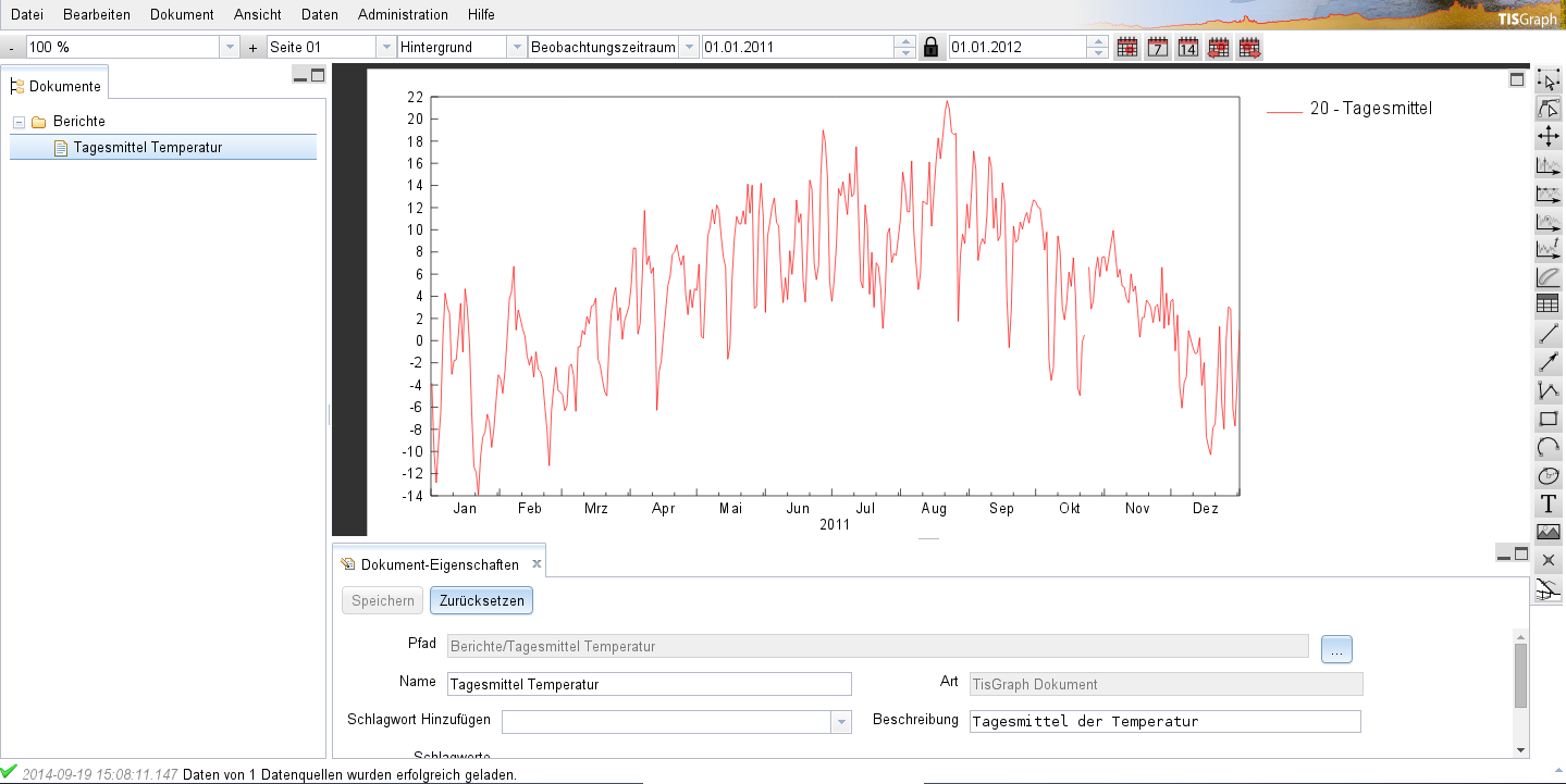
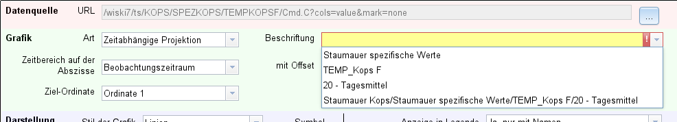
In the provided example, the time series selected contains daily temperature averages. Going back to the main dialog, you can now choose from multiple options to be used for annotating this data set in the graph:
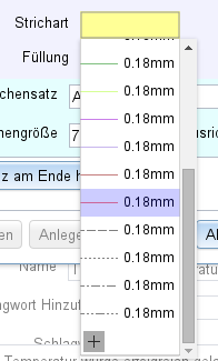
We're choosing the third option, and then select a stroke style in the "Presentation" section:
TIP
In case none of the existing stroke styles is appropriate, new ones can be directly added in the dialog by selecting the "+" button at the end of the list.
- After selecting the stroke style, the "Create and Close" button to the bottom left should now unlock and the graph can be created.
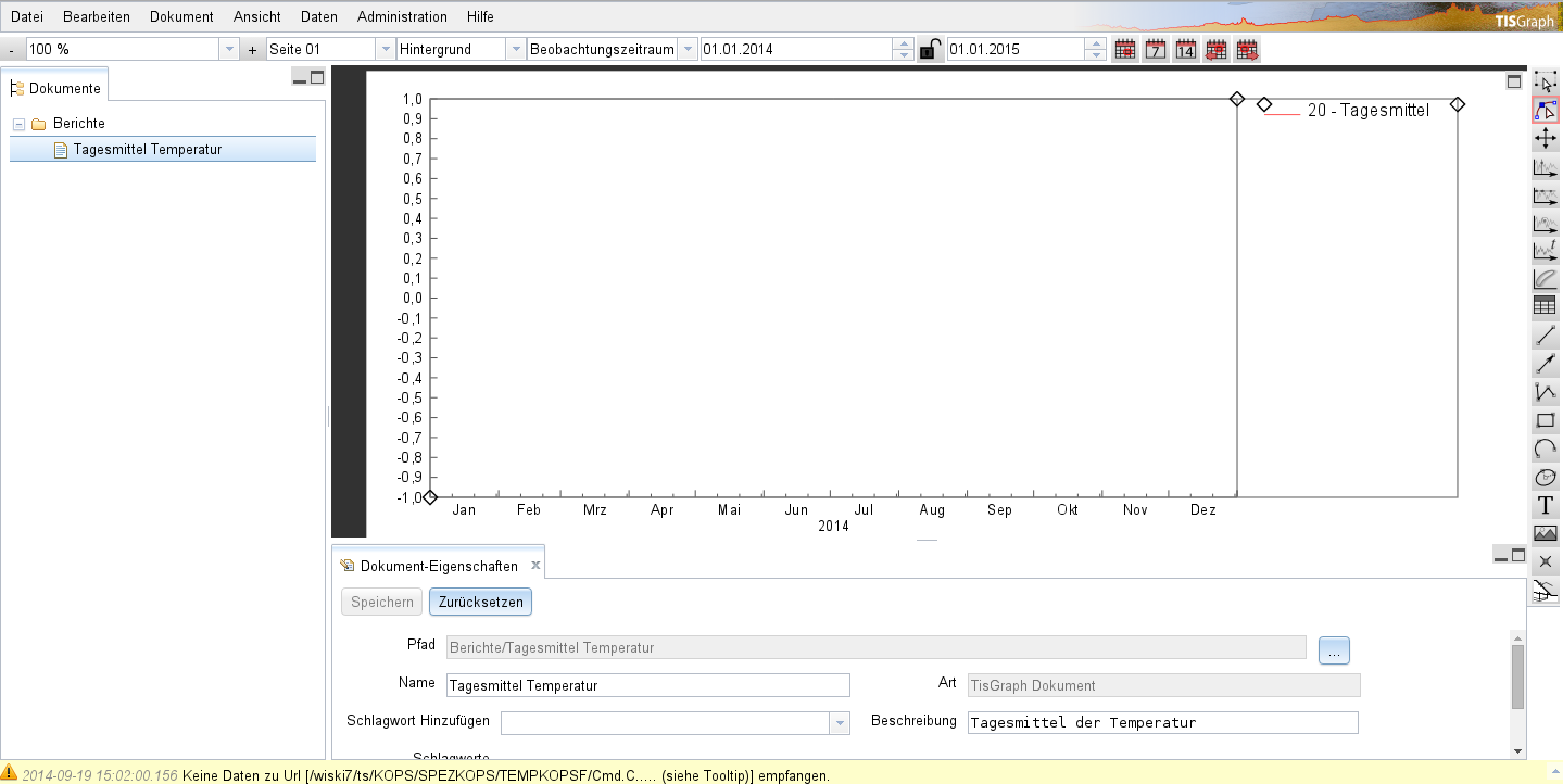
Only one problem remains: We are not currently receiving any data, as a notification in the status bar is pointing out:

- In this case, the problem lies in the fact that this data source does not contain any data for the currently set observation range. This can be fixed by adjusting the range in the navigation bar (the closed lock signifies that the length of the interval will be preserved upon moving its end points):

- Since there is data available for 2011, the graph now displays it (which is also confirmed by the message in the status bar). As can be seen in the example, the value range on the ordinate is automatically scaled to minimum and maximum of the received data.